Anatomy of a Viz

Every visualization is an opportunity to tell a story.  I don’t always take advantage of that opportunity, opting instead to just “display data” in a simple and user-friendly layout.  Granted, sometimes that is what I’m asked to do (business users do love their data tables), but I can say that whenever I approach a visualization as a storyteller, I am more pleased with the results and, candidly, I think the final visualization is always better.

And while my storytelling opportunities at work may be limited, there are countless opportunities “in the wild”.  MakeoverMonday is one very popular option (which I’ve almost religiously contributed to, although I have missed a few and am planning the requisite penance), but more recently I’ve started contributing to the Viz for Social Good project, a wonderful initiative that connects the data viz community with the non-profit community, harnessing and directing our geeky skills towards some very worthy causes.
 
I’d like to use this blog post to explain how I approached my latest viz for that project, both because a few people have asked about some of the specific design techniques I used and because it might help the future amnesiac me remember what I did (and why).  I find that as I age, repetition and reminders are increasingly my friends.

Getting acquainted with the story

Before I could figure out what story I wanted to tell, and then select the right design elements to support that story, I needed to acquaint myself with the contours and key details of the possible narrative.  This seems like an obvious step, but I can’t tell you how often I’ve just started building a viz only to get lost in a maze of charts and calculations that may be pretty or technically sophisticated but don’t say anything meaningful.
 
Chloe Tseng, the founder and driving force behind Viz for Social Good, always provides supporting materials for each project, including links to websites, news articles and relevant data sets.  So what were my main takeaways/impressions after perusing the materials she provided for the Hidden Genius Project initiative?
  • The focus of the project is explicitly young black men.
  • The focus of the training is technical, particularly coding.
  • African Americans are underrepresented in tech (both in terms of education and employment) and missing out on the growing opportunities in that field. 

So, in a sentence: Young black males are missing out on the growing opportunities in tech because they are not receiving the education they need to participate.

 
There were other possible stories to tell (e.g. the history of the Hidden Genius project, the structure of its programs, the number of students who have participated, individual success stories, etc), but the three items listed above are what resonated with me and what I wanted to focus on.  I also felt that the project’s website already did a great job telling some of those other stories, so linking to it (vs. replicating it) felt like a more fruitful approach.  That said, I’ve seen a few amazing vizzes that focused on some of those other elements (see here and here), but I suspect I wouldn’t have done as good of a job had I taken that approach since that isn’t where my inner storyteller wanted to go.

Selecting the story elements

The Central Image

Once I had the story I wanted to tell, the central design element came to me pretty quickly.  I wanted to have a photo of a young African American man dominate the viz, with half of his face obscured.  To me, this image conveyed the central theme of the story, namely that young black men were both overlooked and under-represented in the technology field.  I also felt that a large photo would have a more visceral impact and (hopefully) draw people in more than a number of charts would.  There would be charts too, but I wanted them to play a supporting role.
 
Finding the right photo took some time, since I needed it to meet a few specific criteria:
  • It needed to be available for me to use, i.e. not have restricted usage rights.  I didn’t always pay attention to this when I created visualizations, but I now know to make sure any image I use has been shared by the photographer in a way that allows me to use it without violating copyright.  Many photos are shared under Creative Commons, so the available pool is still pretty big, but it is both prudent and respectful to make sure any image you use is one you should use.  
    • An easy way to check is to use the Google Image search tools and only select images that are labeled for re-use.  
    • Some sites (like Flickr, where I ended up finding the photo I used) also allow you to see the usage rights for an image.  Clicking the “Some rights reserved” will tell you exactly what you can and cannot do with the image.
  • I wanted it to be monochrome and have no background.  I know that you can desaturate any color photo and remove backgrounds, but those post-production steps don’t always produce the best results, so I was looking for a photo that I could use as-is.
  • I wanted a photo that would look good big.  Some photos shared online are available only in smaller sizes that get very pixelated when you enlarge them.

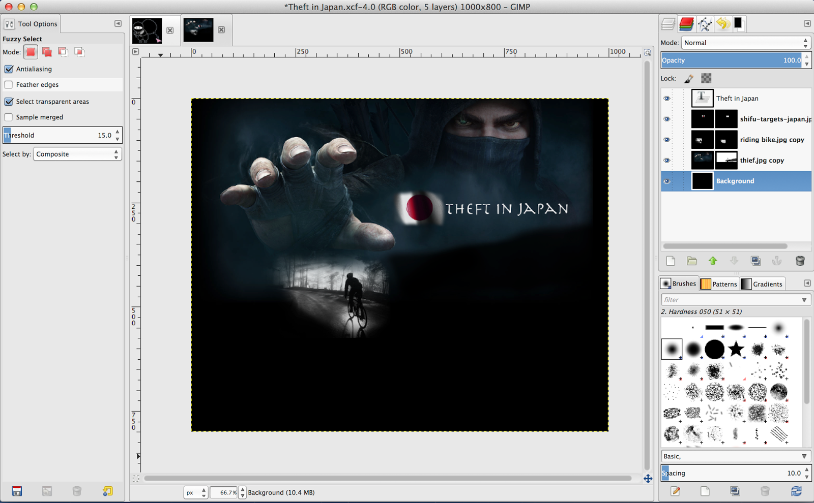
I eventually found the perfect photo and went about obscuring one half of the young man’s face.  There are a number of ways to do this.  Pooja Gahndi (who inspired me to use semi-transparent images in my vizzes) uses MS Word, but since I have a Mac without MS Office, I do my photo prep in the free software GIMP.

 
The steps to create a split and semi-transparent image are pretty simple:
 
1. Open the photo in GIMP
 
2. Duplicate the layer (right-click on the image in the Layers palette and select Duplicate Layer)
 
3. Lower the opacity of the bottom layer.  This may require some trial and error to get to the right amount.  Since I wanted to still see a little of his face, I set the opacity to 15 (or 14.9 in the uber-precise Gimpian universe).
4. Add a layer mask to the top layer, initializing it to “White” (or full opacity).
 
5. Use the paintbrush tool to color in half of the layer mask with black.  What painting with black does is obscure any part of the image that you paint over, allowing anything underneath to show through.
 
6. Save the image as a .png file, as that will maintain the transparency.


Once you have the semi-transparent image file, simply open it inside of Tableau by dragging an Image object on a dashboard tab and selecting the file you just saved.  In my case, I also set the dashboard background to black so that the image blended in the way I wanted it to.

The Color Palette

I wanted to let the Hidden Genius logo drive the color palette.  As such, I decided to only use monochrome colors (i.e. gradients of black, white and grey) and the specific shade of green used in the logo (which I sampled via the color picker tool in Tableau and added as a custom palette).

In particular, I wanted to use the green as an accent color to identify the focus areas of the story, which were African American men and the Tech field (specifically coding/computers).  So, in each of the charts and text boxes, I only used that green to format elements that related to either African Americans or the computer industry.

Floating and Faux-Transparency

Now that I had my central image and overall color palette, it was time to start adding the other elements to my dashboard.  This is where floating and floating order become indispensable design tools, since they allow you to have precise control over layout and how the different elements on your dashboard interact.

I wanted to divide my canvas based on the split nature of the photo.  The left side would highlight the “Hidden” nature of African Americans in STEM fields (both in terms of employment and education), and the right side would focus on the opportunity available to the untapped potential of this target demographic.


So, first came the title, which is just two text boxes floated on top of the photo.  Their placement and formatting are very deliberate.

  • I chose to make the “Hidden” text box smaller than the “Genius” text box (80 pixels high vs. 100) and used more subdued colors to shift the visual emphasis to the right.
  • I placed the “Genius” text box atop the young man’s brain, as that is where the untapped potential resides.  This also ties in with the quote I chose for the bottom portion of the viz, namely “There’s value in you, your brain, and what you’re going to create.”
  • I used a skinny text box (height of 1-2 pixels) to connect the two text boxes, which helps underscore that this project guides the young men from obscurity to visible success.


The rest of the left side is comprised of a couple sheets and a few text boxes.   Beyond the choice of color palette described above, I only made a few additional formatting decisions:

  • I set the Worksheet shading to ‘None’ so that they inherited the background color from the dashboard (i.e. black).
  • I made sure the worksheets were lower in floating order than the photo.  You can do this by selecting and dragging the objects where you want them on the Layout panel.  This is the way you make it appear that the sheet background is transparent.  In actuality, the photo is just on top of the sheet, but since you’ve set the opacity of the photo very low, it doesn’t obscure the chart.
  • I positioned the line chart so that the young man’s right eye could still be seen.
 

The right side followed a similar approach, only I didn’t need to worry about floating order as much since I didn’t want any of the elements (the snippet of code, the bar chart) to be on top of the young man’s face.  I just nudged things around the canvas until my OCD was satisfied. This mostly involved using the Position and Size settings in the Layout pane to ensure each element was where I wanted it to be.

Finishing Touches

Sometimes I like to place borders around my text boxes, and sometimes I don’t.  Sometimes, though, I only want a border on one side of a text box, as a way of providing a little separation between the text box and the background without being too “heavy”.  To do this I can’t use the standard formatting options, since it’s all or nothing when it comes to borders (i.e. all four sides or no sides).  In these cases, you can use another text box (with a width of 1-2 pixels) and simply place it alongside the edge of the other text box.

Text box without borders
Text box with a skinny text box acting as a left-hand border


And finally, since there were a number of data sources used for this viz, I wanted an easy way for the viewer to see where the data came from (and maybe get a little more contextual information) without having to go to another tab or reference a single info pop-up in one corner of the viz.  So instead I created a few info sheets and placed them directly next to the specific data I wanted sourced.


Each info sheet contains a single measure (I created a measure called ‘One’ which is just the number 1) with a Mark Type of Shape. For the shape I used an information icon downloaded from Google.  Read this post in case you don’t know how to add custom shapes to Tableau.  It’s very easy.


I set each sheet to have a width and height of 20 pixels and placed them onto the dashboard canvas.  I then added the necessary reference information to each sheet’s tool tip.  Since I wanted people to be able to hover over these sheets and read the information in the tool-tip, I made sure that these info sheets were higher in the floating order than the main image.


___________________

Each viewer will ultimately decide whether all of these design choices aided the visualization.  Was the story clear?  Was it compelling?  Did I make it easy for them to engage with the data?  I certainly hope so.  But I will know that I did my best job when I can clearly articulate why each element was added to the visualization and what purpose it served in telling the story I wanted to tell.  And by being able to do that, I believe I increase my chances of connecting with my audience and making a successful visualization.

Thanks for reading.

Crossing Streams is a Good Thing in Alteryx

When you’re fighting ghosts, crossing streams might be something you want to avoid. But when dealing with data inside of Alteryx, you should embrace creating and crossing as many streams as necessary to get the results you want. 


A co-worker was recently confronted by an Excel spreadsheet that didn’t want to conform to the workflow he was building in Alteryx. It was one of those spreadsheets that are all too common in corporations – blank rows, hidden columns, stacked headers, sub-total rows sprinkled throughout, etc. The only corporate “norm” it didn’t possess was a rainbow color palette.  


In this case, he needed to extract the total forecast volume by product and calendar date from the spreadsheet shown below. 

In other words:


1. Grab only the subtotal rows
2. Strip out the word “total” from the product name
3. Grab the calendar date header, but only from the columns where the secondary header didn’t say “Actuals”

Number 1 and 2 seemed pretty straightforward, but #3 presented a challenge since it wasn’t immediately clear how to pull out the date header as it was one row above the other header values.  However, after a bit of noodling, this proved very quick and easy to accomplish with a handful of Ateryx’s awesome tools. 

Step 1 – Create two data streams 

In order to associate the date headers to the rest of the data, I needed to break out the Excel file into two data streams that could be joined together after a bit of clean-up. The multiple streams also allowed me to get rid of the blank rows I didn’t want. 

By adding a Record ID tool to the Input tool, I could then use a Filter tool to select Row 2 as one stream and Rows >= 5 as a second stream, getting rid of rows 1, 3 and 4 which were blank. 

Step 2 – Create a column ID field 

Now that I had two data streams, I needed a way to join them back together and add the calendar date from stream one to the data in stream two. The logical field for that would be the column position in the spreadsheet. So I used a Transpose tool to un-pivot the data in both streams at the same point, namely where the main headers ended and the date fields began.

At this point in the workflow all of the column headers were the default “F#” format you get when you import an Excel file without explicit headers. I would need to add actual header names eventually but those numbers were what I would use to generate the column ID field. All I needed to do was strip out the “F”. Easy enough with the RegEx tool.

Once I had the column ID in both streams, I could use that field in a Join tool to add the calendar date to the main data stream as an additional field.  Now I had a complete data set with every calendar date associated to every product.  Only problem was that the date was showing as a number vs an actual date. This happened because a column can only have a single data type and each column in the spreadsheet contained strings, numbers and dates, which could only be handled by a String data type, a conversion that reverted the formatted date value into the Excel date number value.

Step 3 – Convert the Excel date number into an actual date

A quick search of the fantastic Alteryx Community forums landed me on the solution for this. Since the number Excel assigns to a date value is simply the number of days since Jan 1, 1900, all I had to do was create that arithmetic calculation and wrap it inside of a DateAdd function to spit out the original date.

Step 4 – Name the columns

As I mentioned above, many of the column names still had useless names like F1, F2, etc.  The columns I had added to the workflow, via the Join or a Formula tool, already had good names but the original fields from my primary data stream did not.  Those field names existed as data values in the first row. 

 A Dynamic Rename tool allowed me to use those first row values to rename the headers.

Step 5 – Grab only the total rows

The final step in getting the required data set out of this Excel file was to filter the data set down to just the total rows.  I used a Filter tool to look for any row where the word “total” existed. There were two fields where this word existed – PROD_NO and ROLL_UP. I chose the latter but either would have worked – the PROD_NO field would have required a Contains condition whereas the ROLL_UP field required an Equals condition. 

Once I had the totals, I used a RegEx tool to strip out the word “Total” from the product name since then I could cleanly join this data with other product data (the data in this particular Excel file was merely one of several inputs in a larger workflow).

And with that, the Excel file was tamed and ready to play nice with my other data sets.  Thanks for reading.

A love letter (of sorts) to Makeover Monday

Throughout my life I’ve had an uneasy relationship between my logical and creative impulses. I’ve pursued both, but have generally allowed the logical impulses to dominate or win when a crossroads was reached. For example, as a kid and young man I had dreams of going into filmmaking or writing, but I never allowed myself to fully embrace those dreams (I.e. put in the requisite time and effort) because my logical side convinced me that these paths were too risky to go down without a solid practical fallback. But in going about establishing the fallback (e.g. getting and keeping good corporate jobs) I allowed the fallback to become the path, and the road my creative side had dreamed of traveling down became an alleyway I’d periodically take a detour into instead.
This isn’t to say that the logical path is a bad or unfulfilling one. My logical impulses are still a fundamental part of me (it is why I am happier in an orderly vs messy house, and why I get a visceral thrill when I build workflows in Alteryx), and following the practical path has provided me and my family with a relatively comfortable life. But when the logical side is disproportionately catered to, like when I allow my perfectionist tendencies at work to eat up the hours I could have spent out in nature with my camera, I really feel that imbalance and seek out ways to right the existential ship.
I know this dissonance is fairly common, and there are likely multiple reasons why I struggle with it. Although, if I had to synthesize my psychological conflict down to a single moment from my past, it’d be the time my family and I were visiting my aunt and uncle in Germany, back when I was a 16 year old daydreamer with gauzy aspirations of becoming a famous film director.  We were all sitting in my aunt and uncle’s basement, which had been converted into a bar with liters and liters of exquisite German beer on tap.  My uncle, a successful businessman, and my dad, a successful lawyer, were talking about how much happier they were in their 50s than they ever were in their 20s and 30s, mainly because of the comfortable lives they’d built for themselves and their families.  My mom and aunt were sitting at the other end of the bar discussing the struggles some friends’ kids were going through due to their dogged pursuit of a “Brotlose Kunst” (German for “breadless art”, I.e. artistic endeavors that don’t earn any money).   And I sat between them, enjoying the buzz from a beer I would eventually grow quite fond of while fortifying a worldview, forged of pragmatism and insecurity, that saw no viable connection between that early artistic hardship and a desired future of comfort and happiness.  As a result, my creative impulses tended to remain in the basement (metaphorically) while the pragmatic / logical pursuits took over the main floor.
Enter Makeover Monday
This autobiographical preamble is just a way of explaining why I’m so appreciative of how the Makeover Monday project and community has encouraged me to marry my logical and creative impulses in ways I hadn’t before, and why my love affair with Tableau has only deepened as a result, since that impressive piece of software doesn’t stand in the way of this often unlikely marriage.
In my particular case, the creative and logical coupling has taken the form of adding photos to my Tableau vizzes. And not just adding an image to the top of my viz (which I’ve done before), but rather selecting images that captured an essence of the story the data was telling and then allowing the selected image (or images) to influence all of my other deign choices, including dashboard layout, background colors, fonts and which dashboard elements should float (increasingly all of them).  This approach to creating a viz is very different from the way I’ve designed most Tableau vizzes throughout my career, where tiled order, simplicity and unemotional displays of data have been my guiding principles. At work, where I did the majority of my Tableau vizzing prior to Makeover Monday, I was definitely on the Few side of the Few/McCandless spectrum.  And while there is nothing wrong with that (there’s a reason why Few’s guidelines are part of the bedrock of data viz education – they do very effectively convey information),  it’s good to flex across the spectrum and explore the benefits of connecting with your audience on a more emotional or aesthetic level.
For example, one of the weeks’ data sets involved theft in Japan.  It contained some interesting tidbits, like the fact that theft of women’s underwear was a big enough event to warrant its own category in the data set, but the big story seemed to be that bicycles were far and away the most attractive target for Japan’s thieves. Conveying this fact wouldn’t require more than a simple bar chart in descending order of incidents – the bar for bikes is much larger than all other categories.  But how interesting would that visual be?  Not very.  It’d get a nod of approval from my bosses at work (along with perhaps a frustrating request for a complimentary table of numbers), but that wasn’t my aim this time.  I wanted a photo backdrop to that bar chart that conveyed the key takeaway (that bikes were the favorite target of thieves in Japan) in a more emotionally engaging way.
So to Google Image Search I went.  I find that this part is often one of, if not the lengthiest part of the design process since it is so important to find good images. Not only do they need to convey some part of the data story, but they should ideally be composed in a way that encourages the layout of an effective dashboard. So negative space (I.e. a portion of the image file where nothing exists) or the ability to extend the image into negative space (I.e. using masking to blend the image into a larger, complimentary background image) is something I look for.  I also allow my intended mood for the viz (humorous, serious) to help me filter the results down to something I want to use.
In this case, when I came across the image of the masked thief reaching his large hand toward the viewer, I knew I had my anchor photo.  But I needed to incorporate Japan and bikes into it somehow in order to complete the scene. Pictures of bikes and the Japanese flag were in ready abundance, but I wanted images that either reflected or could be incorporated into the overall sinister feel of the main photo.  The image of the Japanese flag already embellished with shadows was perfect, and the heavily silhouetted photo of a bicyclist riding away from the camera would work because it both didn’t add unnecessary color (I intentionally searched for monochrome images) and was moody enough that it could convey multiple feelings depending on how it was used.

To have it fit into the dark mood I was going for, I knew that I wanted the bicyclist to be riding toward the outstretched hand of the thief, like he was riding into a trap.  In order to achieve that, I would have to extend the bottom portion of the thief image so that there was enough room for the bicyclist photo to fit and still have some negative space below it (I didn’t want any of the layout elements to bump up against the borders).

This is where layers and masking entered the process, photo editing techniques I hadn’t used in a while but still had muscle memory for. Since I no longer had a working copy of Photoshop (the software I’d used in the past to layer images), I downloaded GIMP, a free and Mac-friendly software package that provides most of the functionality Photoshop does and in a very similar interface.

Using the photo of the thief as my baseline, I created a new layer that was just as wide but about twice as long, and then filled it with a single color sampled from the bottom of the thief photo (using the color picker tool). After that I dragged the thief photo atop the new layer, added a mask onto the thief layer and then used the brush tool to blend the transition between these two layers so that it looked like a single image.

Once I had that, I dragged the bike and flag images on top of the thief layer (so that I now had four separate layers), arranged them where I wanted them (with the bike below the hand, and the flag near the head of the thief to reinforce the story of Japanese thieves) and then used masking and brushwork on both the bike and flag layers to blend them into the overall image. This primarily involved removing the hard borders so that the visual transition between these photos and the background layer seemed natural. After adding a simple text box for my dashboard title, I had a complete background image I could export from GIMP and bring into Tableau.

I sized the dashboard to be the same as the exported image file and then placed the image into the dashboard. At that point it was just a matter of bringing the simple bar chart I mentioned earlier onto the dashboard as a floating object and editing the bar colors so that the Bicycle bar stood out from the rest. I chose to use the same red as was in the Japanese flag to visually connect the elements together. To add a bit of humor into it, I also highlighted the bar for women’s underwear, making it the same pink color as the panties in the underwear ninja cartoon I serendipitously discovered during my initial Googling.  All I had to do with that one was replace the blue background with a black one.

While the final viz didn’t convey any additional information over what the basic bar chart offered, it was certainly more engaging and a hell of a lot more fun to create.

I used a similar approach for another week where we looked at the militarization of the Middle East, an arguably more serious data set but one where the embedded stories could just as easily get neutered by a quotidian visualization. In this case the story that resonated most with me was the fact that lying just beneath the surface of these numbers were human lives destroyed by warfare.  So I wanted to create a connection between the sterile numbers that counted the volume of arms traded and the lives that those weapons ruined. To do that, I envisioned a layout where the top section focused on the number of weapons exported over time and the bottom section drew attention to the human impact of that arms trade. There weren’t any stats in the data set about lives lost, so I knew that this portion of the story would rely solely on the selected image and any corresponding text. I also wanted to create a transition between the top and bottom so that the two sides of this story sort of “bled” into each other.
That blood metaphor influenced my design of the bottom section – it was going to be some shade of red and feature an image that captured the human suffering of warfare.  So if the bottom was going to be red, then the top section would need to be a color that could blend well into red while also serving as a backdrop for the unemotional data that I would have up there. Black fit that bill. While the color black can certainly pack an emotional wallop, it also rivals white in its use as a standard background color and therefore inherits the neutrality that comes with ubiquity.

After a bit of searching I found two images that would work with that color scheme – a black & white photo of shells being prepared in a munitions factory (a visual nod to the counting inherent in the data) and then a photo of a young, bloodied war victim.  I first created a background layer in GIMP set to the dimensions I wanted for my viz (it needed to be long so that the bottom portion didn’t show up immediately when someone looked at it – I wanted them to scroll before seeing the image at the bottom) and then placed the two photos in their respective sections.  Then some masking to remove the hard edges and blend them into a cohesive whole and a gradient fill for the background layer that went from black at the top (sampled from the black in the shell prep photo) to a deep red at the bottom (sampled from the blood on the child’s face) and I had my background image.

In Tableau, I set up the charts to go from the very macro (i.e. the total dollars that have exchanged hands in the arms trade) to the more micro (i.e. the increase in imports into the Middle East since 2002) and made sure to use colors that either pulled directly from the background image or were complimentary to it.  I floated all of them so that I could control the amount of “breathing room” between the charts.  The final step was to add some descriptive text to each of the chart titles to reinforce the story I was telling visually and then the viz was complete.

I recognize that this approach to creating vizzes can eat up a lot more time than the recommended hour we are supposed to spend on our Makeover Monday entries, and that it can run counter to the K.I.S.S. mantra, but for me, the opportunity to move beyond the simple communication of numbers (while still paying attention to the effective communication of story) has been a rewarding one. A design-oriented mindset is not my default state, and so affording myself the time to consider things like color, font and layout has increased my overall confidence in these areas and helped build a new bridge between the logical and creative sides of my personality. While I won’t always take this approach when I visualize data (time, audience and purpose need to align for that), having this option in my toolkit gives me a level of creativity I didn’t have six months ago. And for that I am grateful.
Thanks for reading.

Creating a TWB (Tableau Workbook) Audit Workflow in Alteryx


I recently created my first Alteryx Turducken – an iterative macro inside of a batch macro inside of an app.  I didn’t set out to create a Turducken, but my workflow naturally evolved into one as I pursued my goal, which was to audit the content of my Tableau workbooks.  I know there are a number of resources out there (some free, some not) that will comb through the XML of Tableau workbooks and tell you how many calculated fields you have, which fields are used in which worksheets etc., but I liked the idea of creating my own, both to have complete control over the end product and also to expand my Alteryx proficiency.


I’m going to document my approach in this post for three reasons:
  1. Given how long this took me (I’d never worked with XML before so I went down many dead ends before I got some things to work), I want to create a reference for myself so my next foray into this is much quicker.
  2. Provide a reference to others who might have a similar goal.
  3. Expose my steps in the hope that smarter people out on the interwebs can advise me on how to make my workflow better.

So the first thing I needed to come to grips with was how to read in the XML from any TWB file.  There’s a great XML Parse tool in Alteryx, but it expects you to have a basic grasp of the underlying XML so that you can tell it what to pull in. 


I had no idea what any of this meant when I first looked at this tool, and I still only have a loose grasp of it.  XML is clearly logically structured, but there’s quite a bit of repetitiveness in the code (i.e. elements like column names, worksheets etc. show up numerous times in different sections), making it hard for a novice to ascertain where the juicy and relevant bits are.  And the XML for a TWB with a fair bit of fields and worksheets is intimidatingly long!  One of my workbooks had almost 30,000 lines of code that all looked like this.  God help me.


But the core insights I arrived at after perusing the help were these:
  • The _OuterXML fields are the ones I need to feed into the XML Parse tool.  If I fed in other fields I’d often either get error messages (e.g. ‘Invalid document structure’) or just minimal and useless results.
  • There are multiple key root elements in a workbook (e.g. datasources, worksheets, etc.) that all have children (e.g. column names, filters, etc.) and the same elements could be children of different roots (e.g. a column could be a child of a data source and a worksheet). 
So knowing which OuterXML of which root element to bring in and which children to look for was going to be key to getting the workbook insights I was looking for.  Given that my driving interest was primarily around which fields were in my workbooks (and how/where they were used), I figured I’d start there.

Identifying the Columns in a Workbook

Before I could do any parsing I had to connect an Input Tool to a TWB file and check pretty much everything (root element, child values, OuterXML) since I knew I needed all of it downstream.  I suspect there are use cases where you wouldn’t need to bring all of this stuff in, but I knew I needed the kitchen sink for my workflow. 


Once I had my connection, I then needed to find the columns.  This proved to be a little less straightforward than I hoped it would be, but it showed me how there are at least two ways to arrive at the same end, one that leverages a single XML Parse tool and a lot of RegEx (to parse fields from within long sections of script) and another that uses two XML Parse tools and some simpler Select and Join tools.  I opted for the latter.


The first XML Parse tool (1) pulls in the datasource root and lists out all of the child elements associated with each datasource.  If you only have a single data connection and no parameters, then you will only have one datasource, but if you have multiple connections or parameters in your workbook then each of those will be a separate datasource (i.e. Tableau considers your parameters as a distinct datasource in the XML).  As you can see below (which is showing a Transpose tool placed after the output of the XML Parse tool), each child element is returned as separate data fields in the result set including a separate field for many of the column attributes (e.g. size, type, etc.).   So the first column in the datasource has the field names titled “column name”, “column caption”, etc., the second has field names titled “column 2 name”, “column 2 caption” and so on. But some key attributes (like calculation) are still missing.  Not sure why, but they are.  Perhaps they’re buried inside of the Column OuterXML. 


So I used a second XML Parse tool to bring in the Column child from the datasource root, which gave me a nice table of all of the column names and associated attributes including calculation formula.


This stream, though, didn’t appear to have the datasource name associated with it (at least not in a distinct field I could see/grab), so I was going to have to join the two streams together to get a complete data set with all column names, associated attributes and which datasource it was a part of.  The problem was that the top stream had each column as a separate field (e.g. “column 3 name”) whereas the bottom stream had all of the names in a single field called Name.

To get around this I had to create a formula to take the output of the Transpose tool in the top stream and identify the column name associated with each column field.  In other words, find all instances where the Name field contained the string “column name” and then return the contents of the associated Value field.  I did the same thing for Column ID, which I figure could come in handy as well so that each column in my data set had a unique ID number.


Joining the top and bottom streams on Column name gave me the complete data set I was looking for, at least in terms of all of the columns in my workbook, all of the attributes I was interested in and which datasource each column belonged to. Pretty cool. 


But I did notice one flaw in the content – the calculation formulas often contained references to the non-user-friendly column identifier vs the caption/alias that a user would see inside of the workbook. For example, the field [Calculation_8921123152237715] refers to a field I named QTD Linearity Delta but there’s no way to know that from the calculation string here:

IF [Calculation_8921123152237715] > 0 then “up” ELSEIF [Calculation_8921123152237715] < 0 then "down" ELSEIF [Calculation_8921123152237715] = 0 then "same" END

What I needed was a routine to replace all instances of these identifiers within each formula with the caption/alias it was associated to. This wouldn’t matter much if I just wanted to compare formulas across workbooks, since the actual string content of the calculation was still unique, but presenting this information to any human would be much harder if the entire formulas weren’t comprehensible. 

So this is where the iterative macro entered the picture, since I needed to do this calculation clean up for a bunch of columns within my data set. 

Cleaning up the Calculations with an Iterative Macro

I set up my calculation clean-up workflow to take in the same input stream twice, so that I could use the caption from one of them and plug that into each formula in the other stream where its less readable identifier was being used instead. 


The hardest part of this workflow was figuring out the RegEx I needed to find all instances of the column identifiers in the calculation string and parse them out so that I could use them in both the join tool and replace formula. And since the final RegEx was pretty long:


(\[Calculation\d+\]|\[Calculation_\d+\]|\[[^\]]+\s\(copy\)\]|\[[^\]]+\s\(copy\s\d\)\]|\[Parameter\s\d+\s\d\]|\[Parameter\s\d+\])

…let me break it down for easier comprehension:

  • \[Calculation\d+\]|\[Calculation_\d+\] looks for any string that starts with the word “Calculation” followed either by a series of numbers or an underscore and then a series of numbers (e.g. [Calculation2] or [Calculation_8921123152237715])
  • \[[^\]]+\s\(copy\)\]|\[[^\]]+\s\(copy\s\d\)\] looks for any string that contains the sub-string “(copy)” or “(copy)” followed by any digit (e.g. [Wk/Wk Pipeline (copy)])
  • \[Parameter\s\d+\s\d\]|\[Parameter\s\d+\] looks for any string that starts with the word “Parameter” followed by a space and then one or more digits.

Once I had that worked out, I just needed to set up the “iterative” part of the iterative macro. This involved a few key steps:

1. Set up two Macro Input tools, one for the stream I want to clean and one for the stream that will provide the replacement values.  As I stated above, both of these input tools will take in the same data stream (i.e. the data set I created by joining the two sets of column data), but one will go down a path where the calculations will be cleaned and the other will go down a path to provide the alias values for the calculation strings.

2. Set up two Macro Output tools, one that would receive the processed records and one that would receive the records that still needed cleaning. 


3. Set up a formula to check whether a particular record needs to be processed more than once if it contains more than one “unreadable” column or parameter reference.   For example, this calculation

SUM(zn([Calculation_596726966189228044]))- SUM(zn([Open Pipeline Qtr (Current Wk) (copy)]))

contains two fields that need cleaning, but only one will be replaced on the first pass since the RegEx function will only parse out one column identifier each time.  I could have created multiple parse functions and then joined on multiple fields, but I felt a single parse function inside of a loop was simpler.  So after a record is cleaned the following formula checks to see if there are more column names that need cleaning.  If no, then it goes to the “Cleaned” Output tool, otherwise it goes to the “Still Dirty” Output tool which loops that record back through the macro.


4. Configure the Iterative Macro by telling it which Input and Output tools to use for the iterations and what to do with the output once the iterations were done.


5. Save the macro and then insert it into my primary workflow.


Turning the Primary Workflow into a Batch Macro

So now I had a workflow that read in a TWB file, parsed out all of the columns associated with each datasource and then fed all of those columns through an iterative macro to clean up the calculation formulas. Before I could call it done, though, I wanted to add a few final steps to it. 

1. Just like with columns, some of the datasource names I brought in were in the form of an identifier vs a readable string (e.g. “sqlproxy.42394.437988391204” vs. “Sales Analytics Data”). So I needed to add a routine that read in two different portions of the XML and joined the identifier to its alias and then add that alias into the primary workflow stream. 


2. Pull in the worksheet root object and identify which columns were used in each and then join those results with the main data stream on column name.  This will duplicate records (i.e. if the same field is in 5 worksheets, it and its attributes will show up 5 times in the final data set) but since nothing is being aggregated there is no risk in doing this.  You can still get a distinct count of unique columns (e.g. COUNTD) while also knowing which columns are used in the most worksheets.


Once I had all of this, I had the workflow I wanted…but it could only read in one workbook at a time.  In order to read in more than one workbook at a time (e.g. an entire folder of TWB files), I had to convert the workflow into a batch macro. Luckily that part was really easy.  I just needed to add a Macro Input, a Macro Output and then configure the workflow to be saved as a batch macro. I also needed to set the macro to stack the output so that a single data set was produced that the calling workflow could consume. 


The Turducken is complete 
The last stage of the Alteryx Turducken was also very simple. In a new workflow, all I needed to do was set up a Directory tool to find a folder with TWB files, filter out the TWBX files (for some reason the Directory tool still pulls these in even though I specify .twb), feed the rows into the batch macro I just created and then take the batch macro output and save it as a .tde I can analyze in Tableau.  


Turning this into an app just involved adding a couple Interface tools (Folder Lookup and Action) to the front of the workflow and calling it done. I plan to pepper this with more parsing as time permits, but I’m satisfied with what I’ve dished up thusfar. 

Bon Apetit and thanks for reading.  If you’d like to check out the Turducken, click here.


Controlling the Format of the Cross Tab Header in Alteryx

Alteryx has convinced me that data is infinitely malleable.  You can flip it, spin it, twist it, shape it, break it into a million pieces and then rebuild it into the precise configuration you need.  So long as you know what you want the output to look like, Alteryx will let you get there.  The exact steps may not be immediately obvious (especially to people starting out), but there are enough ways to combine tools that you will ultimately get the output you want.

I recently got a request to take a bunch of disparate data files and produce a single output file.  This is bread and butter stuff for Alteryx.  A few joins, unions, filters and formulas allowed me to take half a dozen individual files and produce (within a few seconds) a single, consolidated Excel file.  Awesome.  Job done…or so I thought.

After I produced the output file, I was given the spec required to upload the consolidated data into a customer’s system.  They needed the data pivoted so that the header dates became columns, with the dates sorted in ascending order.

Okay…that’s what the Cross Tab tool is for.  So I pivoted on Forecast Date (I.e. made Forecast Date the new column header) which did create a column for each unique date, but the field format was wrong.  Whereas the customer spec indicated “MM/DD/YY” for the date headers, the Cross Tab tool was outputting “YYYY_MM_DD”.

However, if I reformatted the date to be in the correct format, then the Cross Tab tool would sort the fields in ascending order based on Month and Day, meaning that January would always come first even if it was in the following year.  This is because the Cross Tab tool sets the column header as a string and sorts ascending with no obvious way to change that sort.  It also adds those underscores, which I don’t particularly like.

In pre-Alteryx days this would have necessitated some recurring tweaking in Excel to change the format of the column headers.  But I knew there had to be a way to make this happen within the existing workflow so that the file generated was immediately ready for upload. And there was, via 4 pretty easy steps.


*********

Step 1. Create a separate data stream that uses the Summarize tool to pull in the original Forecast Date and a new field called “Header Date” that is simply a string version of Forecast Date, but in the right format.  I used String vs Date since the Cross Tab tool converts all column headers to string anyway.

I then used a Sort tool to sort ascending on Forecast Date and a Record ID tool to add a record ID to every row.


What this step produces is a simple 3-column data set that looks like this:


Step 2. Use the Join tool to combine this new stream with the main data stream, joined on Forecast Date.


Step 3. Use the Cross Tab tool to pivot the data as before, but this time using the new Record ID field as the header.


Step 4. Finally, use the Dynamic Rename tool to replace the Record ID with the corresponding Header Date.  This tool takes the main data stream (which is now in cross-tab format, with Record ID as the header) and uses that 3-column data stream I created in Step 1 to replace every Record ID with the Header Date it is associated to.

This produced the output in the required structure and format, adding at most another second or so to the overall workflow time.  And my love affair with this software continues…

Thanks for reading.

Two Colors for a Single Dimension Value in Tableau

For a recent Makeover Monday, I wanted to be able to visually focus on either the positive or the negative aspect of a metric based on the toggle of a parameter.  In particular, I wanted to be able to draw attention to the chosen aspect (positive or negative) by way of a bold color and turn the other portion grey without having to set up separate charts or worksheets.

As with many things in Tableau, this ended up being easier than originally thought.  It just took a couple of calculated fields and the realization that the same value can be given multiple names.

Here is what the view looked like when I was done.  The chart structure doesn’t change (other than the sort of countries) but the same portion of each chart (bar, donut, etc.) takes on a different color depending upon which parameter choice is selected.

The field I had initially used to construct my views was a fairly simple one that identified each response as either positive (“pos”) or negative (“neg”).  It’s also one that I borrowed shamelessly from Andy Cotrgreave’s viz…if someone else does something well, why not borrow it? 🙂

But when I placed it on the color shelf I was only able to assign one color to “pos” and one color to “neg”.

Since I knew I didn’t want to create two charts or duplicate the dimension, the main thing I needed to figure out was how to get the positive and negative values to play two roles, i.e. to be both highlighted and not highlighted depending on what parameter value was selected.  What solved the conundrum for me was the realization that the values of “pos” and “neg” were arbitrary…understandable and logical, but ultimately arbitrary.  I could just as easily have encoded the values as “captain” and “underpants” and the chart would have behaved the same way.  With that insight, I determined that I could encode the values one way when the first parameter value was selected and encode them another way when the second parameter value was selected.  Like so:

Now I have four distinct values within this dimension vs. just two.  The values still just represent the two response types of “positive” or “negative” but I’ve given each response type two discreet aliases.  This allows me to assign one set of colors to the values ending in “1”…

…and another set of colors to the values ending in “2”.
And with that I had the bulk of my desired viz created.  What remained was to create a few additional calculated fields to allow for a dynamic title…

…and to dynamically sort the countries based on either total positive or total negative responses:

I hope this short tutorial proves useful to others.  Thanks for reading.

Row-Level Security On A Published Tableau Data Source

There are a number of great articles that explain how to enable row-level security inside of a workbook (see herehere, and here), but I haven’t come across any that show how to do that inside of a TDE (i.e. a published Tableau data source).  While setting up row-level security in a workbook is useful, that model falls apart very quickly when you want the same security to persist across more than a handful of workbooks.

Why would we want to have the security handled in the TDE vs. inside each workbook?  For us, there were three key reasons:

  • We wouldn’t have to replicate the same user filters across every workbook that pointed to the TDE.  We expect to have dozens of workbooks (if not more) pulling from the same TDE.  
  • We could allow users to create their own workbooks against the TDE using web authoring but ensure that they only saw the slice of the TDE they were supposed to.
  • Any changes to the security model would only have to be implemented inside of the TDE without having to make any changes to the connected workbooks; they would just inherit the changes.
Setting it Up

After some experimentation, the solution ended up being pretty straightforward and simple.  These are the steps we took to make it work:

1. Identify the users and determine what level of data security they need.  For us, there are two types of users – (a) users who are assigned to specific customers (i.e. they can only see data for those customers), and (b) users who are assigned to one or more regional LDAP groups that our Tableau Server uses for authentication (i.e. they can see all data within those regions).
2. For the first group of users, we added their employee IDs to the TDE.  Since we use Alteryx to generate the TDEs, this involved adding a join between the main data set and a secondary data file from Salesforce.com containing the relationships between these users and their customers (e.g. a customer number mapped to an employee ID).  
A zoom on the actual Join portion of the workflow.  We joined the main data stream to the account mapping table based on customer code.
By creating this join we definitely increase the size of the resulting TDE (i.e. from roughly 1.5M rows to just under 5M rows), so this method may not perform well on massive data sets but we saw no performance degradation (and Alteryx generates the whole thing in under 30 minutes).  This is also why we only add in the employee IDs of those users who are assigned to specific customers; all other users (i.e. the second group described above) are handled via their LDAP group entitlements and the ISMEMBEROF function shown in Step 3 below.
3. Connect to the TDE from Tableau Desktop and create a calculated field that determines whether the authenticated user belongs to one or the other group and then filters the data accordingly.  You want this calculation to evaluate to either True or False.

4. Add this calculated field as a data source filter (right-click on the data connection and select Edit Data Source Filters), selecting “True” as the only value to keep.   Then publish the data source to Tableau Server.
Now when I open, create or edit any workbook pointing to that data source, the data is filtered for my credentials without the workbook containing any user filters or blends with secondary data sources.  This also prevents people from removing these user filters from the downloaded workbooks and thereby circumventing the security model.

While applying data security at the database level and connecting to it live is arguably a more robust solution overall, that approach certainly takes longer to set up and may perform slower than a TDE unless significant effort is employed to optimize those queries.  The method I described in this blog post allows us to take advantage of the myriad benefits of Tableau extracts while still delivering data security via a very easy-to-maintain model. 

One Step Closer to Alteryx Nirvana – Building Macros and Apps

I’ve been using Alteryx now for a little over 2 months and have gotten quite comfortable with the tools in the first few collections (e.g. In/Out, Preparation, Join, etc.).  While I haven’t used all of them, I can quickly throw together a workflow that connects, joins, parses, filters & summarizes data and then outputs a tidy TDE for my analysis. But for some reason the Interface tools, and the macros and apps they enable, have confused me.  Unlike my experience with the other tools in Alteryx, all of my initial attempts to use the Interface tools failed.

I’ve read numerous community posts and watched several videos about how to set up a macro, and even had a couple one-on-one meetings with Mac Roach, but my synapses just weren’t making the connections I needed them to…until this week, when the right amount of laziness, stubbornness and OCD combined to break through my mental block.  So for those of you who may be similarly confused by how to set up macros and apps in Alteryx, I offer you my experience in the hopes it short cuts your learning time.

My Challenge

At our company, business users like myself don’t have direct access to our data warehouse tables but have to query the data via Business Objects universes.  The intent is for people to do all of their analysis inside of Business Objects, but there’s no way I’m going to do that if I have a tool like Tableau at my disposal.  So my team has set up dozens of queries in Business Objects, which delivers the data to us in the form of multiple Excel files saved to a network directory.  We then use Alteryx to scrub, augment and union these files together into TDEs.

To make the Alteryx workflow run faster, we tend to copy the files from the network directory over to a local directory (e.g. our laptop or a shared team directory).  I initially did this inside of Windows Explorer (copy/paste) but learned how to build a workflow in Alteryx to do all of that for me.  Its key steps are:

  1. Identify a source and destination directory, and the file naming structure of the files I want to copy.
  2. Join the source and destination directory inputs by file name.  There will generally be the same number of files in both directories (since the main purpose is to just update existing files), but I added a couple steps to accommodate cases where the # of files are not the same, or when there are no files yet in the destination directory.
  3. Check the time-stamp of both the source and destination files and tag the source files that are newer than their destination counterparts.
  4. Create a command formula that will be sent to the Run Command tool to execute a copy/paste of the new files.
  5. Copy/paste the new files from the source to the destination directory

These steps are generic enough that I found myself using this same workflow for a number of different data projects, manually changing out the directory and file naming specs each time.  I knew that this workflow was a perfect candidate for a macro, since only Step 1 (i.e. the inputs) ever changed.  What I wanted to be able to do was to select the project I was working on and then have the appropriate directory and file spec variables passed into this routine.

Based on what I had read, I would first need to turn the copy/paste workflow into a macro that I could then call from an analytical app (which is where I would be able to select the project I wanted to run the workflow for).

Building the Macro

All of the tools needed for building a macro (or app) are found in the Interface collection of tools.

The only thing I need to do to turn this into a macro is add steps that will allow me to feed different values into the two directory tools.  There are two tools that are needed to enable that:

  • Control Parameter – this tool is the configuration parameter(s) of the macro when it is called from any other module.  In other words, it tells the user of the other module what this macro needs fed into it.  So the Label setting (the only setting the Control Parameter has) should be clear (e.g. “Source Directory”, etc.)
  • Action – this is what takes the value entered into the Control Parameter and passes it into the macro workflow.

Since I have two Directory tools in my workflow, and each Directory tool needs two inputs (a directory folder and a file spec), I will need to set up my interface tools to capture four variables.  Since the file spec is the same for both the source and destination directory, I only need three Control Parameters (i.e. inputs) but four Action tools, since I need the same file spec variable passed to two different Directory tools.

As stated before, the Control Parameters are very easy to set up.  Just give them a descriptive label.  The Action tools, while also easy, are a bit more involved.  Ultimately, though, all we need to do is tell it how to replace the values that are currently in the Directory tool.

To do that, we keep the default action type (Update Value) and then select which of the Directory tool variables we are replacing.  In the example below, we are going to be replacing the directory variable.  So we select that and then check “Replace a specific string”.  Now this Action tool is set up to take whatever value is passed through the Control Parameter and feed that into the Directory tool, replacing the value that was put there initially.

We do the same thing for the Action tool that updates the File Spec.  Only on this Action tool we select the FileSpec variable.

Once we’ve set up the four Action tools, we can save this module as a macro and move on to the next step.

Calling a Macro from an App

To add our macro to a new or existing workflow, just right-click on the canvas and select Insert -> Macro.  We just need to browse to where we saved our macro and select it.  It is added to the canvas as a lovely black (or sometimes blue) circle.  I haven’t figured out what the colors mean, but it doesn’t seem to matter.

Initially it will be angry (red exclamation point!) until it is configured.  In the Configuration window, we can see the three Control Parameters we set up in the prior step – destination directory, source directory and file spec.  It is asking us to Select a Field, but there is no input stream yet that will give us a field to select.  So we need to add one.

There are a number of ways to add an input to a macro, but since I want to be able to pass different values based on the project I select, I just need to set up a template input.  And the easiest way to do that (in my experience) is via the Text Input tool.  Just add a new Text Input tool to the canvas and add three columns, one for each of the variables we need to pass to the macro.  It doesn’t matter what values we place in each of those fields (since they aren’t going to actually get used), but for clarity I like to add values that look like what I’ll be using.

Once we connect the Text Input tool to the Macro tool, we can then assign the fields in the Text Input tool to each of our macro parameters.

So far so good.  But now we need to override the Text Input fields with the values we actually want passed to the Macro tool.  To accomplish that we will again utilize the Action tools, only in a slightly different way.

Before we add the Action tools, though, we need to add a tool that lets the user make a selection that will determine which directory and file spec values to use.  There are drop-down menus, list menus, radio buttons, etc, all of which can be used to present the user with a series of choices.  In this case, I am going to use the Drop Down tool since I want to be able to select a single value from a list of several options.

The Drop Down tool can be configured to display lists via a number of different sources, but for this example I just want to type in a list of project names that I can choose from.  The “Manually set values” option lets me do that.

After that I need to add one Action tool for each of the three configuration settings for my macro.  Unlike before, where we used the default action type of “Update Value”, we need to select “Update Value with Formula”.  This will present us with options for what we want to update.  Under the Data menu, you will see the three values that we added to our Text Input template.  Those are the values we want to replace.  Select one of them and then click the little button to the right of the Formula bar at the bottom.  This will open the Edit Formula window, where we can enter the formula we want to use.  In this case, I want a different source directory to be used depending on which project is selected in the drop-down.  A simple If statement will do the trick.

if [#1] = “Waterfall” then 
“\\tableaunetapp.seagate.com\tableau_prod\SMC_Rev_Plng\Production”

elseif [#1] = “Project Connect” then 
“\\tableaunetapp.seagate.com\tableau_prod\SMC\Production”

elseif [#1] = “PLSID” then 
“\\tableaunetapp.seagate.com\tableau_prod\SMC_Rev_Plng\Production”

else “” endif

After we’ve done that for all three Action tools, we have a workflow that looks like this:

To run this app, we just click the magic wand button next to the green “play” button.  A window with the drop-down menu will be presented, where we can make a selection and then click the Finish button to run the macro.

Tethering a Second Module to the App

So now I have an app that can kick off the Copy Files macro and feed it different directory and file spec variables based on the project I am working on.  Pretty cool.  To make this even better, I’d like to kick off the module that unions the files and generates the TDE once the files have been copied to the destination directory.  That way I can get all of my data prep done with a single click of a button.

For this to work, I only need to expand upon what we’ve already built.  The key addition is another macro that can kick off a module based on an input parameter.  I’ve tried to get this to work with the Run Command tool, but it’s been very inconsistent.  Luckily, there is a set of macros available from Adam Riley (and others) that includes a Conditional Runner tool.  This tool has a single parameter, namely the location and name of the module we want to run.  Since the module will differ based on the project I’m working on, I need to wrap the Runner tool inside of another macro so that I can change the module that is run.

Just as with the first macro, the key steps are:

  • Add a Control Parameter with a descriptive label (Module to Run)
  • Add an Action tool to take the Control Parameter and pass it to the Runner tool.
  • Add a Text Input tool that has a single field (“Module Path”) that serves as the input template

Once that macro is saved, it can be added to the App workflow by right-clicking and selecting Insert Macro.  To accommodate this second macro, a few enhancements to the App workflow are required:

  • Add a field to the Text Input tool for “Module to Run”.  This will then be connected to the Run Module macro’s Control Parameter.
  • Add a fourth Action tool that will generate the “Module to Run” value using a formula similar to the other three Action tools.  E.g:
  • Add a Block Until Done tool (the tool with the big grey hand in the middle) and attach the two macros to it, with the Copy Files macro attached to the 1st output and the Run Module macro attached to the second output.  The Block Until Done tool will make sure that all of the files are copied before the module that uses them is run.

Now I have a single, simple module that I can use to kick off all of my key data prep workflows.  I just select the project I’m working on and go do something else while Alteryx copies the requisite files, does the data preparation and generates the TDE.  No more need to open up multiple workflows or run them independently.

I suspect there are other ways to achieve this (Alteryx Server being one of them), but I am really happy with the efficiency this has added to my daily and weekly routines and that (once my brain connected the dots on how macros worked) it didn’t take very long to set up.

Thanks for reading.

Using a Parameter to Change a Tableau Table Calculation’s "ComputeUsing"

On Twitter today, Brit Cava asked whether it was possible to use a parameter to control how a table calculation computes (e.g. table across vs. table down).  In addition, she wanted to know if it was possible to have both a % of total measure plus a normal sales volume measure inside of the same dynamic field (i.e. different numeric formats in one field).  And naturally, this all had to happen in a table.  We both seem to live in a world where we’re constantly having to sate people’s desires to meld Excel and Tableau…

Initially I wasn’t sure if this could be done, but I’d had three cups of coffee by then and allowed my caffeinated curiosity to checkmate my doubt.  Lo and behold, this multi-format, cross-dimensional table calc wizardry is quite easy to achieve.  You just need to set up a few calculated fields to make it work.

Setting up the Calculations

In this example we want to calculate the % of total Sales, but be able to select whether we want that % of total to be calculated across category for each region (i.e. how much of each region’s sales does each category represent) or across region for each category (i.e. how much of each category’s sales does each region represent).

Since we can’t dynamically change an individual measure field’s “compute using” via a parameter, we need to set up two distinct % of total Sales measures, set the “compute using” independently for each, and then use the parameter to toggle between them.

So let’s first create a % of Total 1 field (as shown below), and then just duplicate it and give the second one the name of % of Total 2.

Next we need to create a parameter.  Since we’re going to want to be able to select Sum of Sales in addition to the two % of Total calculations, we need to set up the parameter with three choices:

1. % of Total – Compute Across
2. % of Total – Compute Down
3. Sum of Sales

We then create a third measure called Table Measure (my naming choices are highly creative), which selects the appropriate measure based on the parameter.  If we were just going between the two % of Total measures, we wouldn’t need to add the “*100” next to each of those.  But since the two percent measures are going to be in the same field as the Sum of Sales (a whole number), we don’t  want to deal with decimal places for the Sales figures (e.g. we want 124,500 instead of 124,500.00).  So we multiply the % measures by 100 to turn a .34 (34%) into a 34.  We’ll deal with the “%” sign in a moment.

Setting up the Table

To create the table just drag the two dimensions we need for our analysis (in this case Region and Category) and place one on Columns and one on Rows.  Then place the Table Measure field onto the Text shelf.  If it isn’t already formatted, go ahead and format the measure to remove all decimal places.

Then select Edit Table Calculation for the Table Measure pill (right-click on the pill and select Edit Table Calculation).  Here you will set the Compute Using for % of Total 1 to “Table Across” and the Compute Using for % of Total 2 to “Table Down”.  The order doesn’t matter (i.e. 1 could be Table Down and 2 could be Across) so long as each one has a separate Compute Using setting.

At this point we can add the Toggle parameter to the worksheet and just toggle through the choices, watching the values change in the table. The one thing that is missing is that there is no % sign next to the % of Total values (e.g. 34% is displayed as just 34).

To address that we need one more calculated field, one that returns a “%” sign only when the parameter selection isn’t for “Sum of Sales” (i.e. choice 3); if Sum of Sales is chosen then this field simply returns Null.

Then place this new Format Label field onto the Text shelf along with Table Measure.  Initially it will place this field beneath the existing Table Measure field.  To move it, click on the Text shelf and select Edit Label (the three ellipses shown below).  In the edit window, just move the Format Label field directly next to the Table Measure field and hit OK.

Now the % sign will show up next to the number when either % of Total choice is selected, but when the Sum of Sales is chosen it will be just a normal number with no decimal places.

I hope this proves helpful to you.  You can download my sample workbook here.

Thanks for reading.

UPDATE: Joe Mako suggested another way of achieving the same goal, and as is usual with Joe, his suggestion was more elegant and more flexible (and allows us to show the dollar sign for the sales measure).  It’s a similar approach to the one I used in Situation 1 on my conditional formatting post, but leverages the parameter vs. the measure value to determine which one to show.

To make Joe’s approach work, we just need to modify the two % of Total calculated fields and then set up a separate Sum of Sales field.  In all three cases, we only show the result of the calculation if the relevant parameter choice is selected; otherwise, the calculation returns null.

Then these three measures are placed on the Text shelf.  As before, Tableau will place these three measures on top of each other by default, but we can change that by editing the Text label and placing them side-by-side.  This way only one of them will ever show.

Data Chain for January 2016 – Things We Say

One of the things I want to do in 2016 is get more involved with the Tableau community.  I’m not calling it a resolution, since that would jinx it and doom it to failure.  Luckily for me, a number of projects were created after TCC15 to encourage such involvement (Data Dare, Makeover Monday, Data Chain, etc.).  I chose Data Chain because I liked the idea of a regular deadline and someone on the other end expecting me to deliver something, namely a postcard.

The Data Chain assignment for January was “Things We Say”.  I initially interpreted this literally and considered counting specific things that I say (like swear words, thank-yous, etc.) but then after watching a video from my friend on having more meaningful connections with people, I decided to track how well (or not) I do that.  Specifically, I wanted to track my conversations throughout the week.  Since I work from home, and we live on a couple of acres, I spend a fair bit of time on my own.  I’m not isolated in the same way Jack was in The Shining, but I do experience long stretches of time when I don’t physically encounter another human being outside of my immediate family.  So I thought it would be interesting to see how often I have actual conversations with people and thereby opportunities for meaningful connection.


Data Collection

There’s no app for tracking conversations (although I’m sure the NSA is working on one), so I set up a Google Sheet to capture my data.   As there are no clear rules for what defines a conversation, I also had to establish some basic parameters to guide my data collection activities:

  • Live Conversation – has to last at least 5 minutes
  • Staggered Conversation (i.e. things like email and text where there can be a delay between responses but a single topic of conversation is sustained) – has to have at least 3 communications from each side.
  • Group meetings don’t count.  I participate in many of these every day, but I wouldn’t qualify them as opportunities for meaningful connection with other people given their focus on things like project timelines, business performance, etc.

My goal with this was to filter out all of the short exchanges that litter a day (e.g. quick greetings, single comments on Facebook, brief IM’s along the lines of “Hey, can I get X” followed by “Here you go!”, etc.).  I also added fields for whether the conversation was personal or work-related, what type of communication it was (in person, phone, IM, etc.), what time of day it occurred in, etc.

Setting up the spreadsheet was certainly easier than populating it.  I’ve never done any “quantified self” analysis before, and so I had to constantly remind myself to pay attention to my exchanges and dutifully enter the relevant data.  Having the spreadsheet opened permanently on my second laptop helped with the work-related conversations, but things got a lot harder when I was away from my office.  Even though I could enter the data via the Google Sheets app on my phone, I had to remember to do that.  This exercise definitely gave me renewed appreciation for what Dear Data and Dear Data 2 have accomplished; I just needed to produce something in a month, while they needed to do something every week!

The Visualization

I wanted a visual that I could not only draw on a postcard (with my limited drawing skills) but that I could also replicate in Tableau.  Some of Andy Kriebel’s recent Dear Data 2 posts (beauty and positive feelings) employed hub and spoke charts to organize the data in a way that was not only visually appealing, but seemed relatively easy to create on paper.  The only thing I thought I might want to do a little differently is have the length of the spokes vary base on the length of the conversation.  Shouldn’t be too hard, right?

Wrong.  Figuring this part out was definitely harder than it needed to be (and I probably spent far too much time on it, but frustration can quickly morph into obsession).  When I started Googling articles on how to create these hub and spoke charts, I found very few resources that explained how to easily generate the x and y coordinates.  Many of them veered into explanations of network graphs (which can be mesmerizing) or were based on having geographic data (where the lat/long coordinates became the natural x and y values), or just assumed I wasn’t scared of math (“simple trigonometry” are two words I don’t use together, and I have no idea why I’d ever need to understand \mathbf{B}(t) = (1 - t)[(1 - t) \mathbf P_0 + t \mathbf P_1] + t [(1 - t) \mathbf P_1 + t \mathbf P_2] \mbox{ , } 0 \le t \le 1 in order to create a chart that resembles a flower drawn by a kindergartner).

I just needed a way to assign somewhat meaningful x and y coordinates to my 45 rows of non-geographic data.  If I had only a handful of data points I needed to plot, this post by Andy Kriebel would have worked well.  But I needed something a bit less tedious.  NodeXL (an Excel plug-in) was mentioned in numerous articles so I downloaded that and entered my “edge” values (i.e. the “to” and “from” data points) only to generate something that looked sophisticated but told me nothing.

Could I study this tool more, and network graphs in general, and produce a better result?  Yup.  Did I have the time or the desire to do so?  Nope.  So I decided to take a different approach and generate the numbers myself based on the available data.  As I said before, I wanted the length of the line to represent the duration of the conversation.  I also wanted a visual way to differentiate some of the key attributes, specifically whether it was a personal or work conversation, and then whether it was face-to-face (i.e. I could see the person) or not.  I decided on the following:

  • Personal conversations would point up, while work conversations would point down.
  • Face-to-face conversations would point to the right, while the rest would point to the left.

Using those simple rules, I threw the file into Alteryx and had it spit out a modified Excel file with two rows for each interaction (since the hub and spoke needs these two points in order to draw the line) along with the appropriate vector coordinates.  I could have done this in Excel, but it’s hard not to fire up Alteryx if you have access to it.  Although, to be honest, having Alteryx perform these fairly simple data preparations sometimes feels like asking The Incredible Hulk to open a jar that’s just a wee bit too tight.

The resulting file looked like this:
Each interaction had two rows, with the field Path Order identifying the 1st and 2nd row for each.  The X &Y coordinates for Path Order = 1 are all 0,0 (since I wanted the lines to all start from the center), while the X & Y coordinates for Path Order = 2 are just the duration, with the sign (positive or negative) being determined by what kind of conversation it was.  If it was personal, then the Y coordinate is positive, but if it was work-related then the Y is negative.  Similarly, if it was a face-to-face conversation (e.g. in-person, video chat) then the X coordinate is positive, but if it wasn’t then the X value is negative.  Pretty rudimentary, but I could wrap my brain around it.
I pointed Tableau to the Excel file, constructed the viz the way the articles instructed, and voila…

Ummm….that’s not right.  Well, it is right based on the data I fed in, but it isn’t what I wanted it to look like.  I wanted some space between the data points vs. having them overlap like that.  Luckily, there’s a really easy way to add that space inside of Tableau.  I remembered a jittering method I’d employed before and gave that a try.  I created a new field called X * Index (where I just multiplied the X measure by the INDEX() function) and then placed that on the columns shelf instead of the X measure.  I set the Compute Using to be at the level of detail required to get the right amount of space….

…and finally ended up with the visualization I wanted.

Insights

So did I learn anything about myself through this exercise?  Yes and no.  I did expect the general distribution that my conversations took (personal being predominantly in person while work was all virtual, work dominating the mornings and afternoons, at least during the week, etc.), but I was surprised by two things:

1. Despite the fact that I have a number of friends whom I interact with online, I don’t have that many actual conversations with them.  My interactions are generally quite brief.  This is something I should definitely work on.

2. I spent an average of 205 minutes each day (out of a possible 1,020 waking minutes) having conversations with people, with a couple days considerably below that already low average.  While I know some of that other time was spent doing normal things like working, reading, editing my photos, watching TV, etc., it does highlight to me that I might be more cocooned than I want to be.

There might be something to this quantified self stuff. 🙂

The Postcard

As I haven’t drawn anything in quite awhile, I decided to solicit some assistance from my 5-year old son, who draws all of the time.  I showed him what I was trying to do, and while he sort of liked the visual I was going for, he much preferred the “different colored suns” that he saw in Andy’s post…and so he drew one of those instead, naturally (to a 5-year old) swapping out the sun for a black hole. 🙂

The Tableau Workbook

If the embedded version below doesn’t render properly, you can click over to it here.
https://public.tableau.com/javascripts/api/viz_v1.js